Ranking the World Baseball Classic Uniforms
6Go ahead, “serious” baseball fans. Make fun of me for being way into the World Baseball Classic. While you’re flicking your boogers and obsessing over who’s going to come out of Spring Training with your team’s coveted “sixth middle reliever” position, I’ll be watching the most thrilling baseball ever played in March.
But I’m not here to talk about the baseball, exactly. I’m here to talk about the uniforms. Unlike soccer, where some countries have established iconic uniforms and logos - Brazil’s yellow-and-blues, Italy’s azzurri, Germany’s whites and blacks, England’s three lions - international baseball uniforms are still in the process of acquiring whatever meaning they’ll have for fans. So messy feelings need not get in the way of a cold-eyed graphic critique. Good thing, too, considering my last-place choice…
(One note: since almost every team is wearing a hideous shade of gray for their “road” uniform, presumably mandated by MLB or jersey providers Majestic, I didn’t hold that against any one team. It really is ugly, though, as you can see in the Canada photo below.)
16. USA
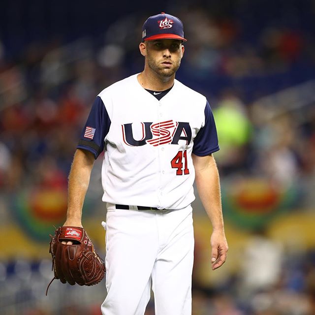
I am thrilled that, after three straight disappointing WBC finishes, the USA has a team that looks capable of finally winning this thing. But those uniforms are a mess. That jersey logo is some 1994 Wal-Mart looking crap. The cap logo is, unbelievably, even worse: way too detailed, not in any way related to the jersey logo, and just plain ugly. This uniform is so bad that Uni Watch, the established authority on athletic aesthetics, is running a redesign the Team USA uniform contest. Entries are due by March 17. Give it a shot. Your idea can’t be worse than what they’re wearing now.
15. Chinese Taipei

They designed a decent cap logo and then stopped. Oh, except for adding the words “Chinese Taipei” under the left breast logo in letters too small to read, which ruins the one thing - simplicity - this uniform had going for it.
14. Australia

I love the green and gold. But the Southern Cross arrangement on both cap and jersey is too much. The AUSTRALIA typeface has that cheesy desktop-publishing look. And the A logo has too many fine lines for a cap logo. Dial down the detail but keep the color scheme and they could have a great one.
13. Korea

Three WBC 2017 teams are taking the Dodgers/Royals route of classic white and blue. Korea is the worst of them because of that awful MS Word brushscript font. The Korean flag and the Korean language both have bold shapes and strong lines. Let’s hope their baseball team takes a cue from those by 2021.
12. China
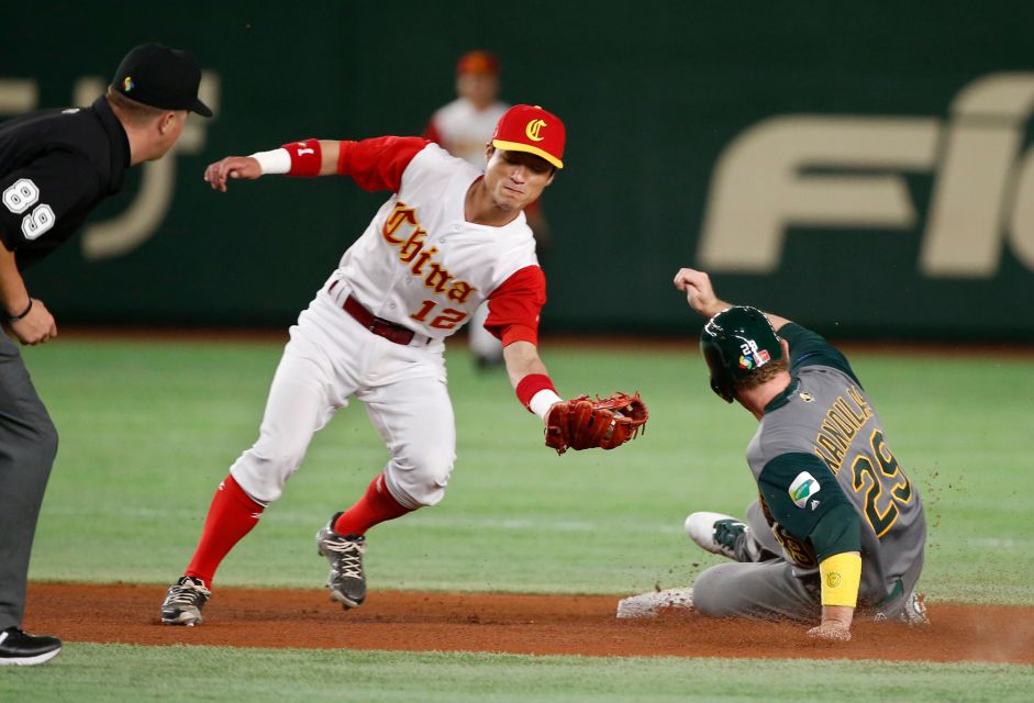
You can’t go wrong with a single Olde English letter on your cap. But this ketchup-and-mustard color scheme hurts my eyes. And the Olde English lettering doesn’t work as well to spell out an entire word. My recommendation: deepen the yellow, use less of it, make the C on the cap white, and use that same C on the left breast of the jersey (a la the Detroit Tigers) instead of the full word “China”.
11. Colombia
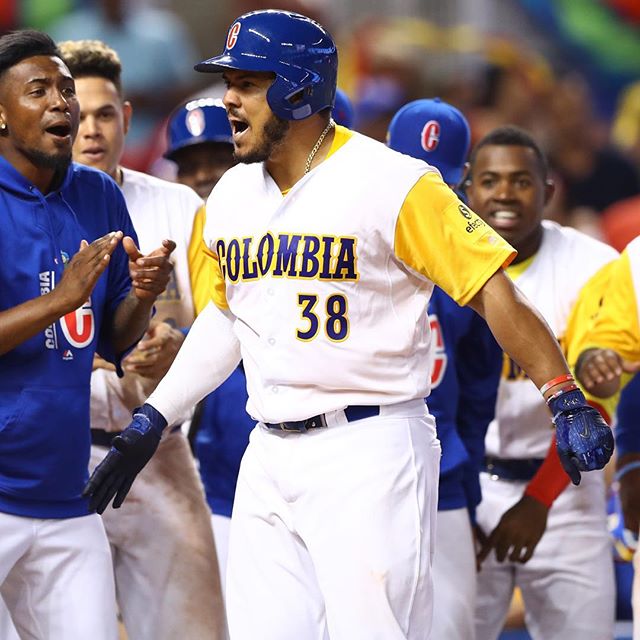
Speaking of yellow, both Colombia and Venezuela use jarring color schemes based on the red, yellow, and blue of their flags. I’m docking Colombia a ranking because they just use too damn much yellow, especially next to white. And because, while I like their old-timey lettering, I don’t like it as much as…
10. Venezuela
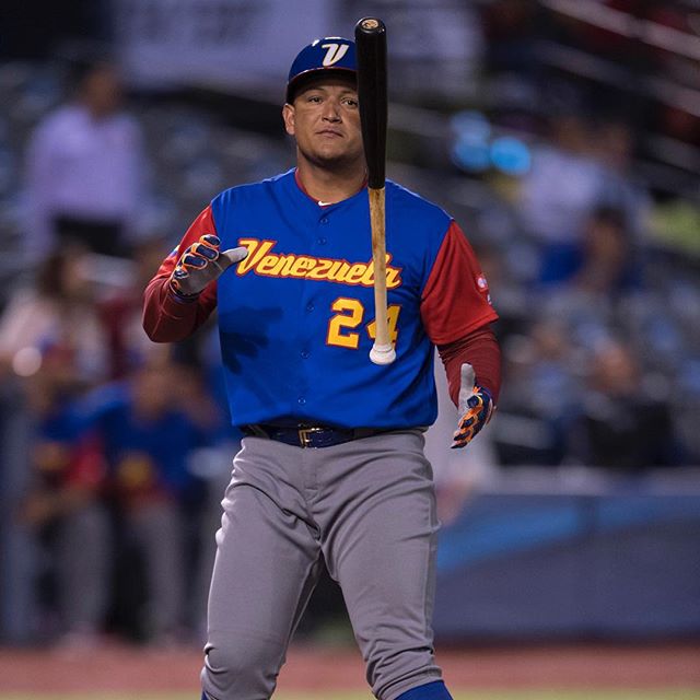
A color scheme like this takes panache to pull off. Venezuela’s wanton collisions of the shades, plus their unique kinda-midcentury lettering (love the cap logo), is so crazy it just might work.
9. Canada
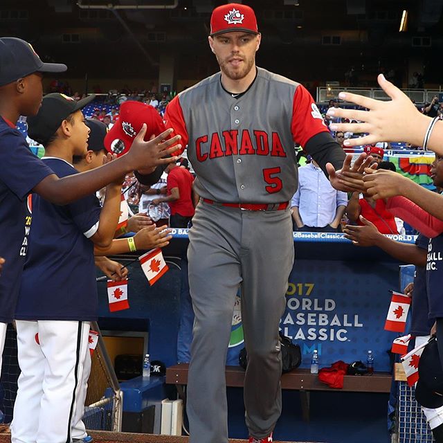
Another promising entry undone by a far too busy cap logo. Canada, you don’t need to mar your iconic maple leaf with a swooshing cartoon baseball to remind us what sport this is. Just the maple leaf would have been perfect.
8. Italy
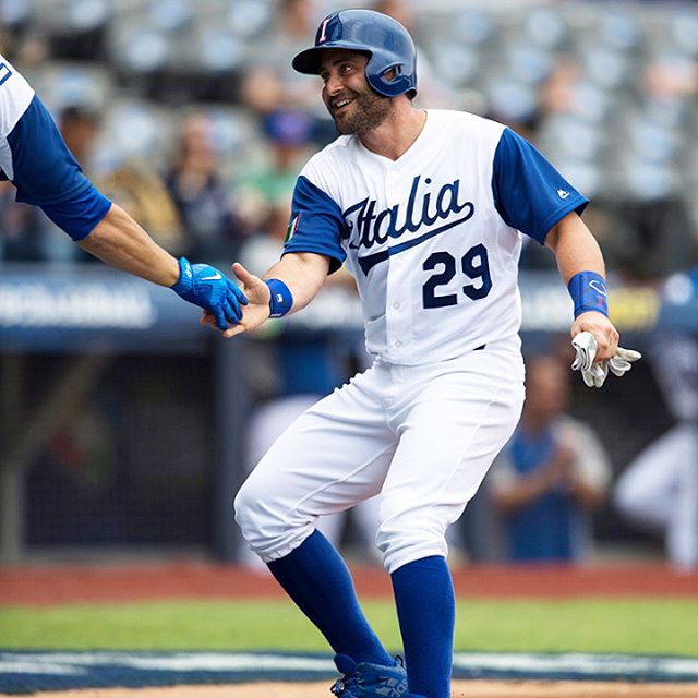
Italy squeaks into the Elite Eight by hitting all the right Dodger notes. Tommy Lasorda should be proud.
7. Puerto Rico
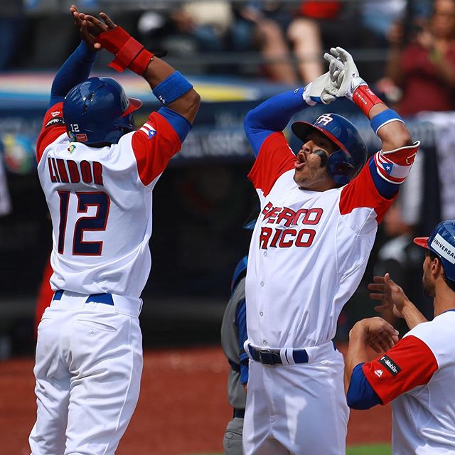
It’s the little touches - the way the O’s line up on the right-justified PUERTO RICO jersey logo, the harmony of the P and the R on the cap, the way the primary color and the trim are reversed on the name and number - that elevate this one beyond red-blue generica.
6. Dominican Republic
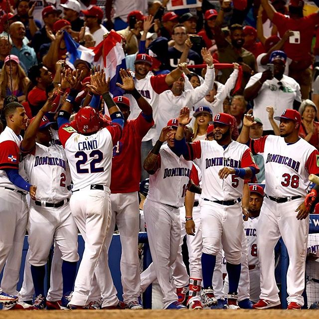
Where Puerto Rico takes a streamlined contemporary approach with the lettering, the DR opts for classic. And since this is baseball, well, well-executed classic is always a winning look.
5. Israel

That cap, of course, has already become an all-time classic, maybe the first true visual icon to emerge from the WBC. I feel like I should hate that jersey lettering, but somehow it doesn’t bother me.
4. Mexico
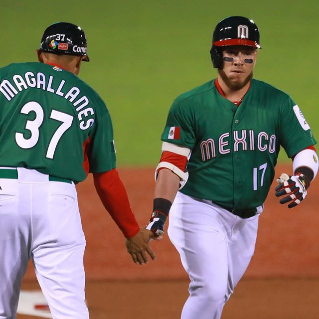
Hands down the most distinctive look of all the WBC teams. Love the lettering. If I were able to shake the unfortunate, accidental Christmas association of the color scheme, this might be my number one.
3. Cuba
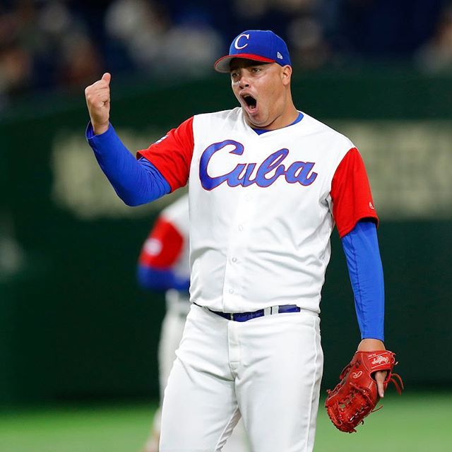
Maybe the only international baseball uniform that does have an iconic presence, thanks to Cuba’s dominance of Olympic and amateur baseball for decades. If Cuba was wearing their legendary all-red uniforms, they’d win the WBC design competition in a walk. Their less flamboyant whites are still good for a top-three finish.
2. The Netherlands
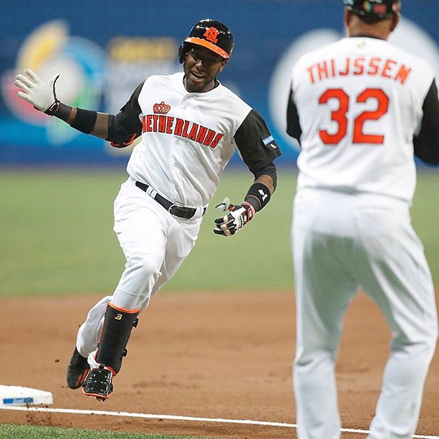
Orange is tricky: you can get away with dressing a soccer team like deer hunters, as the Dutch have famously always done, but that won’t work on the baseball field. This uniform gets the balance exactly right, using orange as an accent color in an otherwise sedate white and black ensemble. The crown is a nice touch, evoking the fairy-tale monarchy of the House of Orange. The only piece of WBC merchandise I own is a Netherlands t-shirt.
1. Japan

Those pinstripes tho. Japan ditched the ho-hum, cheesy uniforms of past WBCs for this striking reminder that they possess one of the longest, most storied baseball traditions on Earth. They’re strong contenders to pull off their third WBC victory this year, but they’ve got the uniform championship in the bag.
- 4 comments, 8 replies
- Comment
I love baseball but the WBC makes me…

/giphy yawn
@denboy Now you know how the rest of the world feels about the “sport” in general.
@DrunkCat indifference is what I’ve experienced in my travels. I’ve seen lots of random Yankees hats on locals, though not a reflection of those people being fans.
@denboy Yawning is generally an expression of indifference yes.
@DrunkCat …and boredom and being tired and needing to pop your ears during pressure changes…yawns seem to be communicative and functional
@denboy Let us yawn together.
@DrunkCat cool, another reason for girls to break up with guys. “You don’t reciprocate my yawns so you obviously don’t love me enough.”
@denboy I saw you yawning at another mehmber! BROKEN UP!
Holy crap, you’re more into baseball uniforms than my husband! And I thought he was way to into it.
The only input I can share is what my husband and I talked about last night. That capital I on Italy’s jersey looks more like a capital T, so they are team T-talia.
@pitamuffin Now I can’t unsee that T! Your husband sounds like a super cool dude. Treasure him.
I really don’t understand why so many baseball uniforms have hats with completely different designs, and seemingly completely different designers.
Why isn’t the C on the Cuban uniform that nice cursive one instead of what just feels like “My word processor didn’t have the font so it substituted a Times New Roman C”?
There’s a cap on the list which I’m eyeing and I really like, but I’m not about to shell out $35 for a cap which I won’t wear…