Gilding the Dingbat: Part 2, the Devil You Say
11Zapfing the dingbat
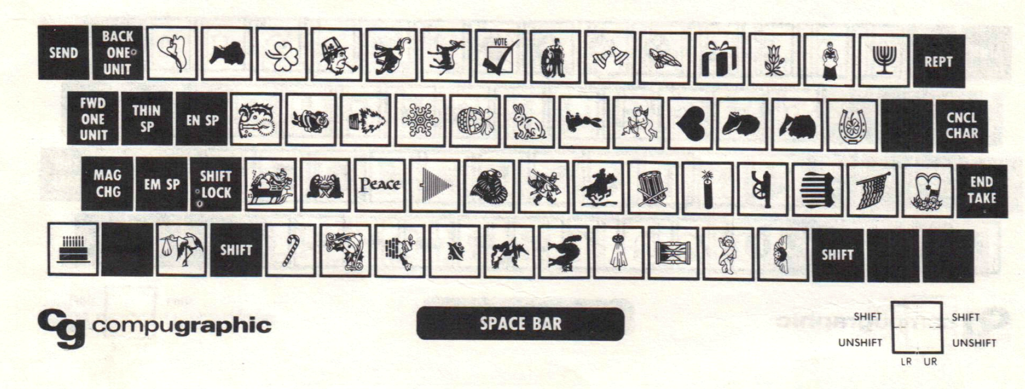
The citation record is pretty unclear about when dingbats made its leap into the type case, covering typographic ornamentation that was always miscellaneous, and had become more so with the ease starting in the 1870s of creating more different characters of type (due to the pantograph, a mechanized tracing/cutting tool) and producing them (in the 1880s, with the start of hot-metal typesetting).
The Oxford English Dictionary only finds its first citation for this meaning in 1921 (in the OED’s 1993 supplement). But I can find easily find references that predate it, which all cluster around 1917 and 1918, which makes me wonder if someone popularized it at the time. The journal Postage: The Magazine of Direct Mail Advertising has a strange article in its January 1917 issue called “Dingbatting the Sermon the Mount,” which becomes clear when you see dingbats as tiny sketches used to illustrate a point. The article notes:
Dingbats are right pictures.
Dingbats tell you a story at a glance.
Dingbats save time and make you smile.

The First Steps in Job Composition (1918) uses the term quite crisply in its definition list:
Florets—Small ornaments; generally, conventionalized leaves. Also called, humorously, dingbats, flubdubs, etc.
I expect it’s late that we see the term defined in print, because it would have been used informally in type shops long before reaching magazines. By the late 1800s, newspapers more deeply intersected with the growth of advertising-driven commerce, which bled into a greater variety of symbols and signs to catch attention and occupy less space than spelled-out words. The more graphical presentations meant more flourishes, signs, and symbols, but there wasn’t particular a name for them.
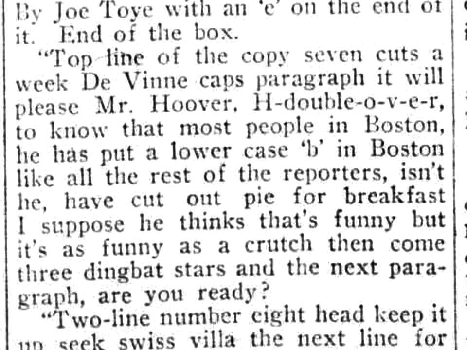
By 1917, a columnist for the Boston Sunday Post described a dust up with a proofreader, which includes him overhearing the proofreader read off layout instructions to a typesetter. The proofreader says, “three dingbat stars,” meaning something like * * * being inserted between lines.

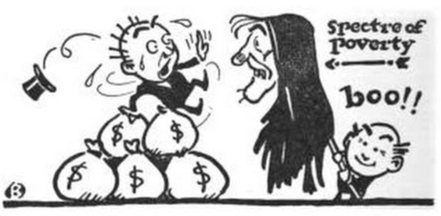
There’s an unrelated, far earlier word that came to mean about the same thing in time, however incorrectly: “pi” (often “pie” in earlier days), which dates to 1659 in the OED. Type became “pied” when it was scrambled together, often when dropped on the floor. Pied type was put in the “hell” box that the “printer’s devil” (usually a young boy or teenaged apprentice) had to sort out back into the correct type cases. (Gutenberg set the stage for printing terms relating to elements of the church—the studio is called the “chapel”—and its antithesis, in a joking way.)
Sometimes the pi-ing was intentional, as in this front-page newspaper story in the San Francisco Call from 1895 about two printers who maliciously pied the type at the Catholic Office’s printing studio. (Why? No motive.)

However, by the era of phototypesetting, which started in earnest in the 1960s and started to dominate typesetting outside of newspapers by the 1970s, the term pi slid from jumbled type to meaning miscellaneous symbols, just like one would use the term dingbats.
It’s towards the later part of the phototype era that the typographic definition of dingbats became broadly understood because of preeminent type designer Hermann Zapf (1918–2015). He was known for creating elegant faces that had deep historical roots with fresh approaches, and which became quickly used and often imitated. His typeface Palatino was included with the Apple LaserWriter Plus, making it instantly overused, but his Optima is more influential—a “humanist” style that lacks serifs, and relies on tapering lines instead of straight ones, which softens it.
While he started his career in the metal era, Zapf embraced phototype and then digital with the same aplomb. Some designers dug in their heels; he became a professor of typographic computer programming in 1976 at the Rochester Institute of Technology.
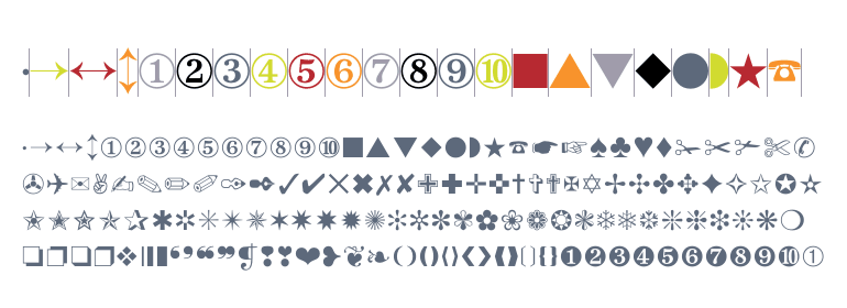
Just before and around that time, he also sketched out over 1,000 images for a dingbats family with a unified graphical approach for the International Typeface Corporation (ITC). ITC picked about 350 of them, and released them around 1977. A decade later, Steve Jobs licensed Zapf Dingbats for the LaserWriter Plus, along with Palatino and Zapf Chancery.

After Zapf came the flood the flood of ornaments. It was still expensive, proprietary, and time-consuming to create phototype fonts, but once digital tools appeared and became relatively affordable, typefaces of all kinds multiplied, including ones with both general and specialized symbols. Wingdings is probably the second-best known, designed by other well-regarded type designers, Charles Bigelow and Kris Holmes, and released by Microsoft in 1990; Webdings followed in 1997.
Zapf Dingbats became part of the repertoire of Unicode in 1993 with Unicode 1.1, although as a subset of the whole, including characters that didn’t have other representations. The Unicode block is called simply Dingbats, although an Ornamental Dingbats block was added in 2014 that’s mostly florets.
Once Web standards finally coalesced in enough browsers to allow the consistent downloading of fonts, it seems as if every site with unique symbols of any kind developed their own dingbats fonts. It’s more efficient for a browser to retrieve a vector outline and use it than managing bitmaps, and the vector has the advantage of rendering to any scale, pixel density, orientation, color, and other parameters.
Emoji aren’t the equivalent of dingbats as such, even though that Postage article about the Sermon on the Mount noted above seems like it has something in common with Emoji Dick. Rather, the first set of emoji was largely made up of dingbats—astronomical signs, numbers, transit symbols—but had a handful of drawings to convey emotional state.
Over time, emoji drawing evolution and diversification across platforms and ecosystems (like Facebook and Twitter) have taken them away from the relatively simple symbolic expression of most dingbats, even as more elements that would formerly be called dingbats are now part of the set. Is a lobster dingbat different than an emoji lobster drawing?
Buried in dingbats, people now rarely refer to them that way. It doesn’t feel a fitting end for a word with such diversity in its evolution that the only popular definition left is Archie Bunker’s.
Glenn Fleishman is a veteran, grizzled technology reporter who writes regularly for the Economist, Macworld, Fast Company, and Increment. His latest book, London Kerning, about typography and printing history in that city, of course has a pun in the title.
- 6 comments, 3 replies
- Comment
✔ ➉/❿
Fascinating! Thanks!
Makes me wonder if “pied” was a phonetic expression of “pyet”; maybe a meta-joke of what happens if you drop “type” on the floor.
@mehcuda67 Nyet! It probably is corrupted Dutch or something, because when you scratch an unknown term with murky origins in the printing office, it’s always some transformation of a European-language word that’s been anglicized. Like wayzgoose!
@glennf Ahhh. And you made me look up wayzgoose in Wikipedia. While I was hoping it was an archaic measure of avian mass (approx. 3x wayzchicken or 64x wayzsparrow), the etymology suggested was much more interesting!
This is excellent, thank you.
Also holy wow, Optima is gorgeous: https://www.myfonts.com/fonts/linotype/optima/
Is the kerning of the title on your book’s cover London-style?

/image London kerning
@eonfifty I love that rendition of words and no streets!
I covered dingbats and religion. The devil is in the details.
“But I can find easily find references” I assume the first find was a typo?